
People talk about finding their aesthetic as though it's a decision.
I'm not sure it is.
Trends are decisions. Visual language feels more instinctive than that.
I spent two years as a fashion photographer in Germany. Studio shoots, editorial work, clients with briefs and boards and very specific ideas about what they wanted. I was good at giving them what they asked for. But the images I kept — the ones I printed and held onto — were never the brief. They were the frame before the brief, or after it. The moment when no one was directing anything.
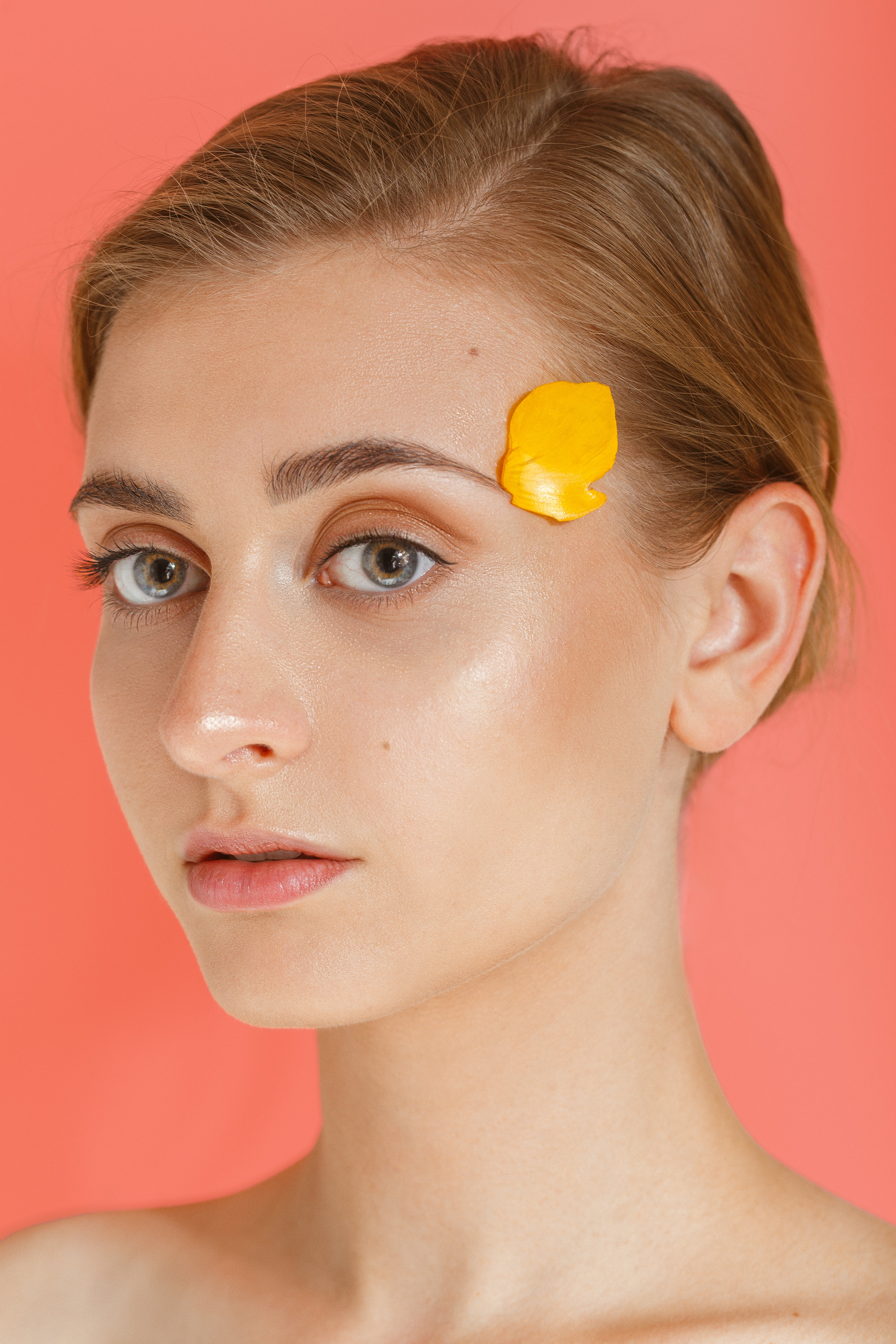
Photography by Shirin Hollaender
That gap between what you're asked to produce and what you actually see is where your visual language lives.
I've been thinking about that gap ever since I left.
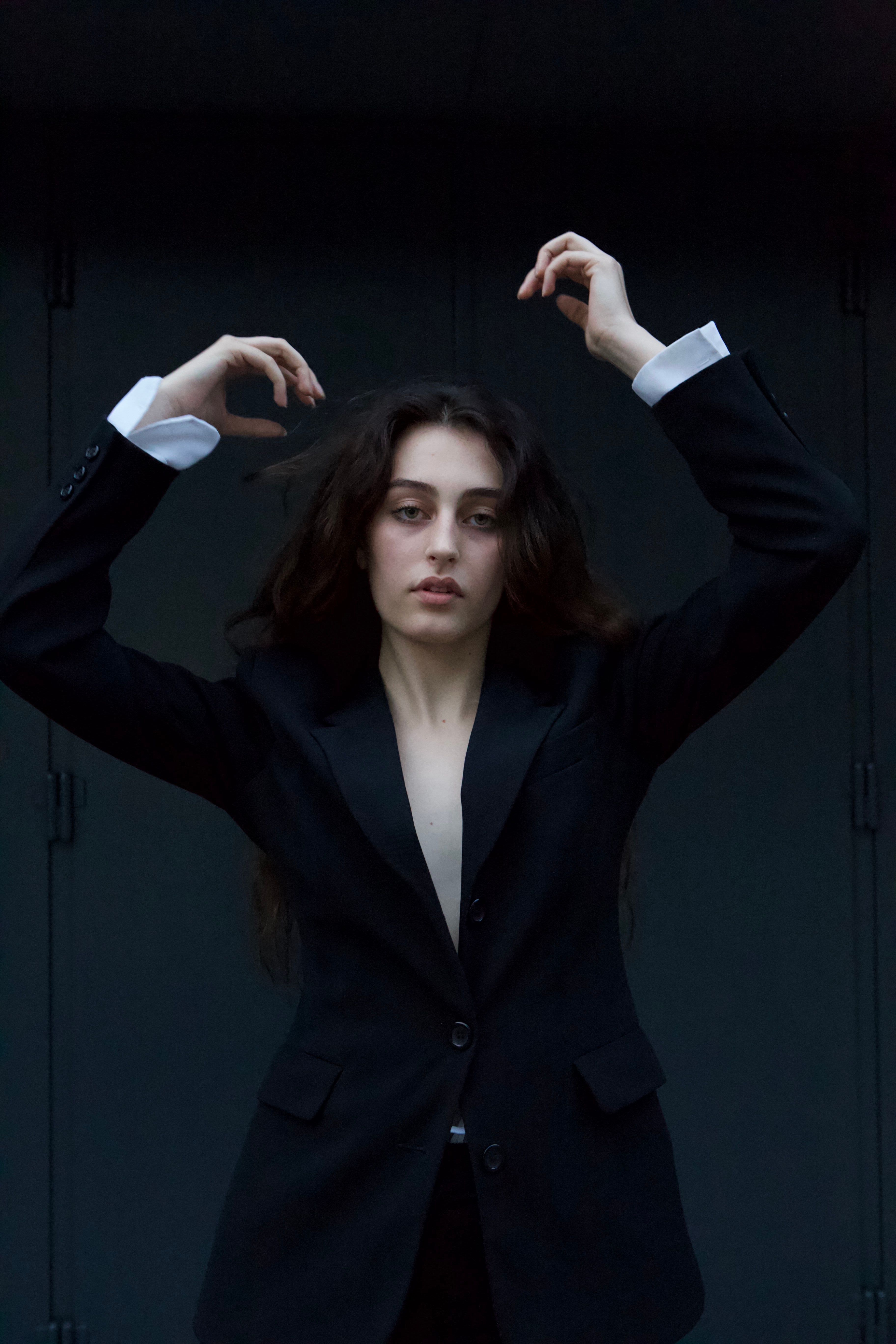
Photography by Shirin Hollaender
The older I get, the more I realise I keep returning to the same atmosphere rather than the same style.
Not a formula. A feeling.
For me, it has always circled back to something like the ocean. Not literally — no nautical themes, no curated coastal identity. Something subtler.
Movement. Depth. Softness with edge. A certain kind of quiet power.
I see it long before I consciously choose it. In photographs I save. Colours I gravitate towards. The art that stays with me after everything else has faded.
Deep blues. Sea greens. Salt-soft neutrals. Metallic light. Things that feel weathered, lived-in, slightly untamed.
And despite trying other directions — cleaner, louder, more trend-led, more commercially legible — I inevitably come back.
Not because I'm loyal to an aesthetic. Because I recognise myself there.
That's the difference.
Annie Leibovitz is someone I return to not for the obvious reasons — not the celebrity portraits, not the scale — but for what her images understand about intention. Every element is a sentence. The light. Where someone stands. What they're wearing and why. A photograph, in her hands, doesn't document a moment. It argues for one.
That's something I absorbed early and have never been able to unsee.
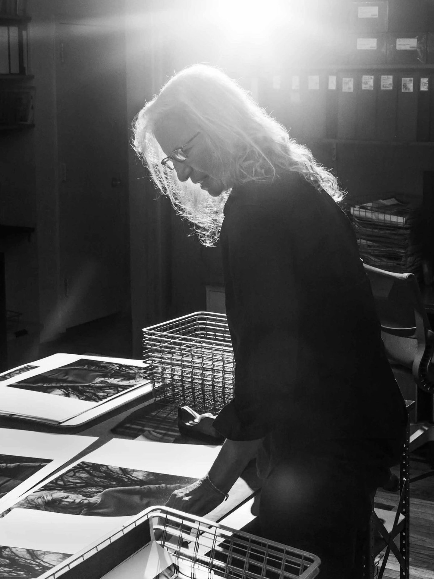
© Annie Leibovitz / via Instagram
Amberly Valentine does something different. She shoots on medium format film, processes by hand, works mostly in natural light from her base in Bali. Her images are quiet in a way that takes real confidence. They don't announce themselves. They show you a woman, a place, a quality of afternoon — and trust you to arrive at the feeling yourself.
I keep coming back to her work when I'm trying to remember what it feels like to look at something honestly. Without the architecture of a brief around it.
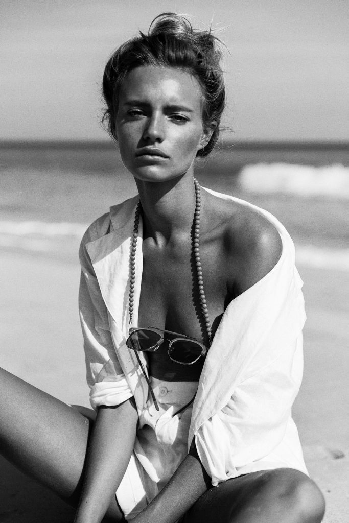
© Amberly Valentine / via likalinea
Cinematography taught me the rest. You learn something from moving image that still photography can't quite replicate: time inside a frame. The weight of stillness before something changes. What a slow pan does to your breathing. The best cinematographers understand that a single image is an extract from a longer sequence — even if that sequence only exists in the viewer's head.
That's what I'm looking for when I stop mid-scroll. Not just a good photograph. A frame from a film I want to see. A world with a before and an after.
We often mistake aesthetics for decoration when they're usually closer to autobiography.
The visual world we build around ourselves tends to reveal more than we realise — not in obvious ways, but in patterns. The same textures appearing across entirely different parts of life. The same atmosphere in the images we shoot, the spaces we're drawn to, the sport we choose.
Looking back, the thread is strangely consistent.
Editorial imagery over polish. Movement over stillness. Natural materials. Collected spaces. Fashion with character rather than performance. Sport that has a visual identity, not just a result.
Padel, of all things, has it. The blue of the turf. The glass walls. The geometry of the court. I noticed the visual quality of those courts before I ever picked up a racket. That's not an accident — that's a language recognising itself.
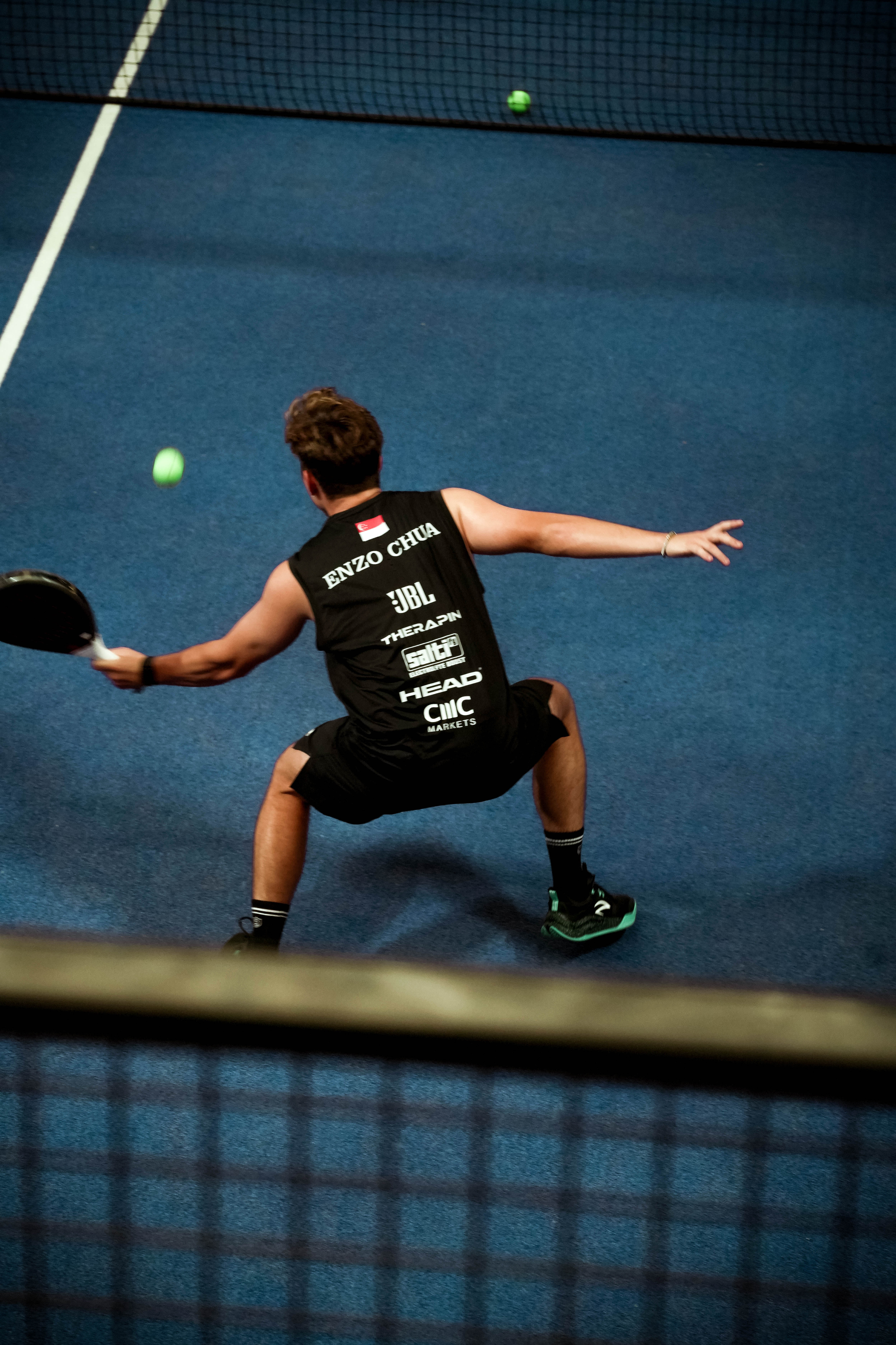
Photography by Shirin Hollaender, Rally Club
I used to think personal style was something you constructed.
Now I suspect it's something you uncover.
Less invention. More recognition.
Maybe that's why the things we repeatedly return to matter — not because they are fashionable, but because they are familiar in a deeper sense. They were always speaking through us. We just had to get quiet enough to hear them.
What visual language do you keep coming back to?
Shirin is the editor of Shirin Magazine and a former fashion photographer based in Thailand. She still saves too many images.